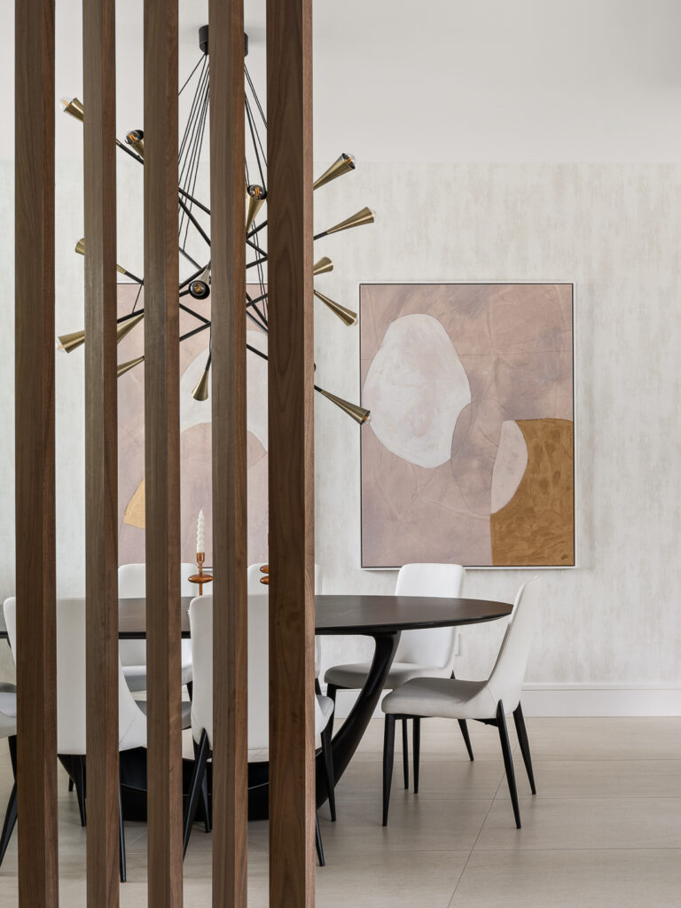
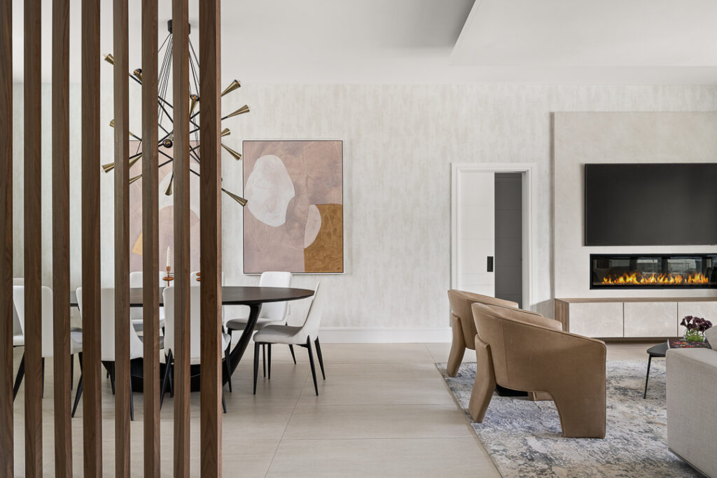
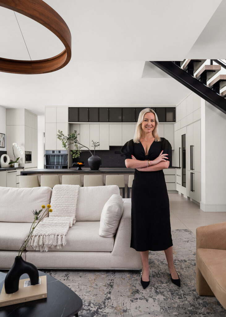
“I tend to lean toward a natural color scheme with a focus on soft, muted tones, paired with bolder contrasts, like walnut wood or black detail, to create sharpness and depth. While I appreciate the use of a bold color scheme in the right setting, my go-to pairing remains the timeless combination of warm grays, earthy beiges, off-whites, greiges.”
“Lately, I’ve been drawn to soft blush and rose tones as well. This versatile palette allows the space to be easily updated over time. It also enhances natural light, which makes the space feel larger and more open. It’s a sophisticated and cohesive palette choice that can effortlessly adapt to different styles and transcends trends.”
Laetitia Laurent
