

Persimmon Accent Ideas from Better Homes & Gardens Feature
Design by Laurie DiGiacomo, Photography by Tori Sikkema Photography
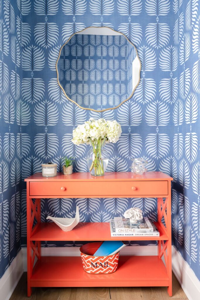
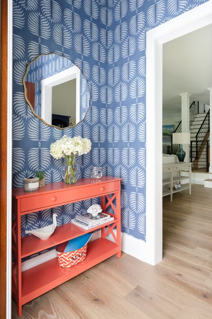
Persimmon—a warm, rich, reddish-orange hue—is making waves in interior design for its ability to infuse spaces with energy while remaining grounded. Featured in Better Homes & Gardens, Laurie DiGiacomo of Laurie DiGiacomo Interiors shares how this vibrant color can be used intentionally to create a striking focal point. “Persimmon has the most impact when used as an accent,” says DiGiacomo. “It directs attention without overwhelming the space.”
Design by Laurie DiGiacomo, Photography by Tori Sikkema Photography
In a recent project, DiGiacomo paired a bold persimmon console with cool blue wallpaper, creating a stunning contrast that allowed the console to shine. This approach works just as well with a persimmon vanity in a bathroom, bringing warmth and energy to the room without overpowering other design elements. For a more subtle touch, DiGiacomo suggests incorporating smaller accents like vases, artwork, or fresh flowers in persimmon to infuse any room with a thoughtful pop of color.
Captured through the lens of Tori Sikkema’s editorial photography, this space exemplifies how persimmon can be balanced beautifully with neutral tones and earthy textures like rattan and boucle. The resulting imagery speaks to a sophisticated yet inviting design, where color plays a central role in creating both warmth and energy while maintaining refined elegance.
Transform your exceptional spaces into compelling visual narratives with your audience.
Schedule your Vision Consulation, here!
Leave a Reply
Master the Path to Publication
sign up for our masterclass
Discover the proven framework Tori uses to help designers secure features in leading publications. Learn how to present your work, pitch with confidence, and attract editorial attention.


