Interior Education with Tori Sikkema, Interior | Brand Photographer
There are so many purposes for using lines in architecture and interior design to nail your compositions. What is the principle behind using lines in design? Lines can affect every aspect of design:
- Form
- Function
- Style
- Texture
- Space Management
Architects and designers use the rule of lines to create balance, harmony, proportion, scale, and visual interest in their designs.
As an interiors | architectural photographer, understanding the principles of using line in design helps me to interpret the story each designer and architect is telling. It also helps me create a unique composition and frame each shot. Being a photographer is an incredibly creative role, allowing me to weave visual narratives with each click of my camera!
There are different types of lines:
Vertical – running up and down
Horizontal – running side to side
Dynamic (zig zag, diagonal, curved)
All these types of lines help define a space and create a cohesive flow, and contrast, and are interesting to inform the eye about how to move within a space (interior and exterior).
Examples of each line in the design:
Vertical Lines
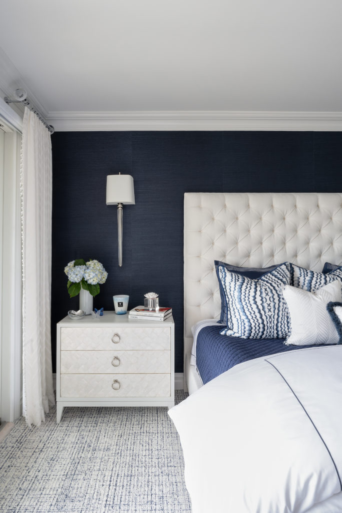
The use of vertical lines can be seen throughout this vignette. As your eyes move through the composition: the drapes, the light fixture and shade, the side table, the upholstered headboard, the blue stripe down the duvet cover, and the blue vertical lines in the carpeting.
This composition nails the use of vertical lines!
Horizontal Lines
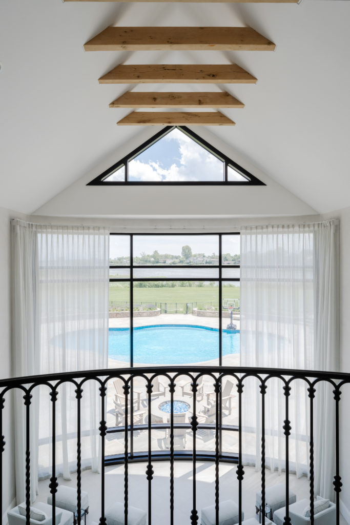
Dramatic views draw your eye to the horizontal wood beams used to accentuate the pitch of the ceiling. Then you notice the lines of the eyebrow window complimented by the header above the panel of windows. The window is framed by three bold black horizontal pieces. Finally, your eye moved to the wroght iron railing with its horizontal line running through the space. Nailed it!
Dynamic Lines
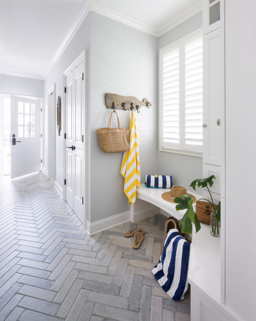
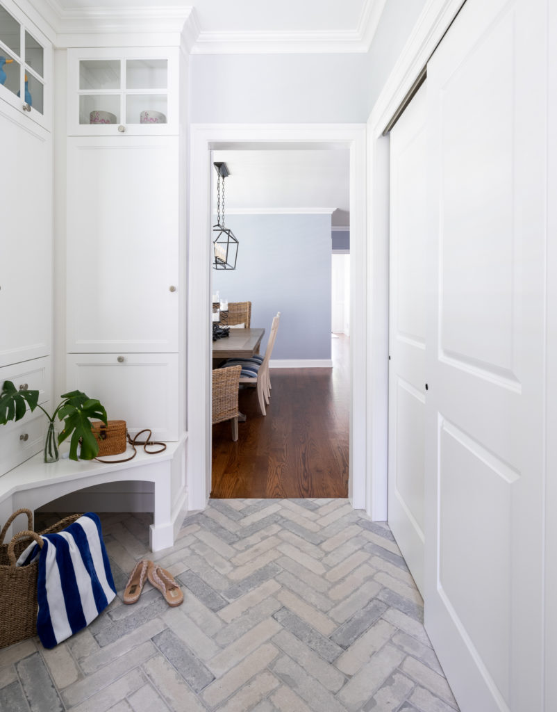
Chevron patterns like the one used as the layout for the tiled floor in this mudroom and hallway are dynamic and draw your eye to the memorizing pattern and hues of colors. Rich Wonsala, RDA Building Contractors, definitely nailed it!
Examples of how to use a mixture of lines in the design:
Mixed Lines
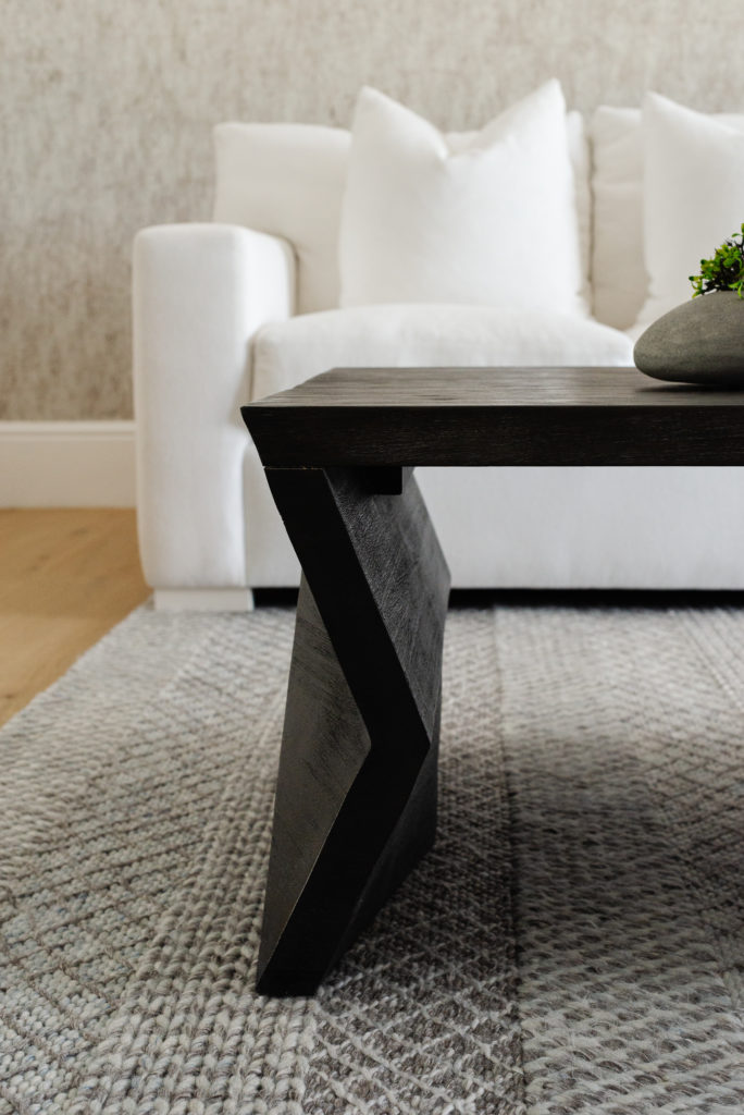

Here we have two incredible examples of the use of vertical, horizontal, and dynamic lines. The composition on the left introduces our eye to the vertical lines of the sofa arm and the lines in raised lines in the carpet. The coffee table, trim, and sofa base weave in the horizontal lines, and finally the coffee table leg, rug pattern, and the round pottery engage our eye with dynamic zig-zag, chevron, and curved lines!
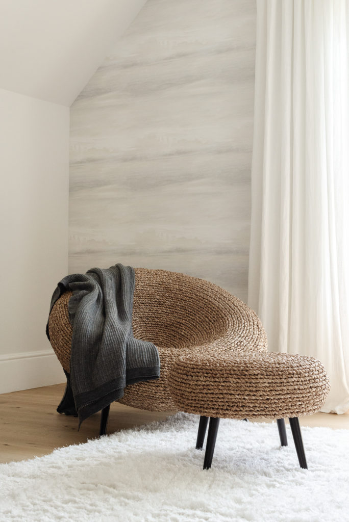
The photo on the right is my personal favorite! We enjoy the vertical lines of the drapes as they ever so slightly graze the floor. then the wall treatment and trim use a horizontal line design to direct your eye through the space. Finally, the rattan chair and ottoman excite our senses with all the curves.
Now that you are an expert in identifying and understanding the use of line in design, I hope this opens up a whole new world to enjoy your design spaces and inspires you to see the design through a new lens!
Let’s connect over a virtual cup of coffee! Click Here
I want to capture YOU in all your spaces and places!